PTE-A Speaking: Describe Image (2) – bar charts
- Remember: there is no point in clicking forward immediately after finishing part of the Speaking part of the PTE exam because all the 5 tasks in this section are timed; thus, you can’s save time by racing to the next question.
Describe image:
You have 30 seconds to observe…explain the stick
The trick to Describe Image is to always speak 5 sentences in the same order for all images. In this way, you become more fluent as you continue to practice:
Procedure
- INTRODUCTION: This (name of graph type) graph denotes (read the title) (always mention the x-axis)
- Describe a key feature (use a superlative – the highest, the most, the greatest)
- Describe a key feature (use a superlative – the lowest, the least, the worst)
- Describe a key feature (use – the average, fluctuate, or volatile)
key features
- CONCLUSION: Use this phrase and predict an outcome: In conclusion, it can be expected that ___—— will continue to rise in the future ( or in the next year)
(please expand images by approximately 200% – apologies)
A more complicated Bar Chart:

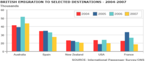
- This bar chart shows British Emigration to selected destinations from 2004 to 2007, which includes Australia, Spain, New Zealand, the USA, and France
- The most popular emigration destination was Australia.
- The least popular emigration destination was the USA.
- The average emigration destination was New Zealand.
- In conclusion, it can be predicted that Australia will continue to be the most popular destination for the British in the future.
- Notice the change in superlative to ‘the most’ and ‘the least’; for some data this change is preferable.
- Never speak about the y-axis; do not say/estimate/ or guess numbers as it is not necessary – just speak through 5 sentences.
The combination Bar Chart/ mixed chart where 2 graphs are on top of each other:

This is the only chart I know where two graphs are piled on top of each other. Further, this is a popular chart on the exam as many students tell me they ‘had this one on the test’.
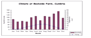
- This chart represents a line graph of temperature measured in degrees Celsius and a bar chart of precipitation measured in millimeters from January to December at Beckside Farm, Cumbria.
- The highest temperature was recorded in August.
- The lowest temperature was recorded in January.
- Precipitation fluctuated throughout the year with a high in November and a low in April.
- In conclusion, there is no relation between precipitation and temperature.
- This is an extremely long introduction, the longest, but it is logical.
- Do practice this type of graph ‘in reverse’, with the precipitation level or in a ‘U’ pattern for the year (temperature always rise and fall with the seasons, so they look the same)

