PTE-A Speaking: Describe Image – World Maps and Mixed Charts
*The algorithm is set for fluency, fluency, fluency!! Therefore, a person just needs to keep speaking at an even tempo without any hesitation, pausing at the end of each sentence, for 31 seconds, and they will achieve a perfect score of 90. Does pronunciation matter? Yes, but by using the same procedure of 5 sentences over and over again, your pronunciation will improve.
This procedure is the easiest method to pass the test with a high score, usually well above 79. There is a long debate in second language learning between the roles of fluency and coherence and/or comprehension for the listener. A speaker may speak quickly but coherence is lost due to pronunciation or rhythmic intonation for the listener; conversely, a speaker may speak slowly with good pronunciation but then fluency is lost, so it is a tiring experience for the listener. In any event, Pearson decided that Retell Lecture and Describe Image at going to be all about fluency!
**Remember: As I did, always keep speaking at a normal tempo or pace for 30 seconds without any hesitation–even if you do not know what you are talking about – and you will probably score over 79.
**The key to the algorithm is there are a certain number of keywords coded into any analysis of a spoken response, so it is always wise to say a word that is written in the title or on the graph (process images for example) in every sentence you speak to ensure that you will score. However, as a counterpoint, what is coded if you get a picture that has no words?
** The images below were taken from colour charts from a google search of PTE Describe Image. You will have colour images on your PTE Exam; here, as well as the exam, colour doesn’t really matter in the sense that you are going to follow the same procedure as it is the numbers that correspond to superlatives that do matter.
World Map

- This world map displays the potential vulnerability to climate change.
- The greatest vulnerability to climate is in parts of Africa and Asia.
- The least vulnerable to climate change is found in the USA, Canada, and Northern Europe
- The intermediate vulnerability to climate change is found in South America.
- In conclusion, it can be expected that climate change will affect the world.
- Always mention a word or two from the title to ensure the algorithm score.
- The conclusion is open for you to say anything along as you use a word from the title.
Mixed Chart

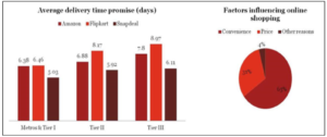
Mixed charts will only show up in pairs as triple charts will always be of the same kind. The trick for mixed charts is to do your number 1 sentence and then a 2nd sentence that mentions data and then repeat this process for the next chart and then add conclusion. Always speak 5 sentences for all charts, remember.
- The first chart is a bar chart that expresses the average delivery time promise for three companies, Amazon, Flipkart, and Snap deal, through Metro and Tier 1, Tier 2, and Tier 3.
- Snapdeal has the fastest delivery time.
- The second chart is a pie chart that illustrates the factors influencing online shopping that includes convenience, price, and other reasons.
- Convenience is the most important factor at 35%.
- In conclusion, convenience and delivery time are the most important factors for online shoppers.

